Designer’s Desk: Nine Principles of Design
When we think of designers, we tend to envision creative innovators who think outside the box and love breaking convention. All of this is true of a great designer, but beneath our seemingly idiosyncratic ideas is a fundamental set of guidelines making it all work. These guidelines are called the Principles of Design. In last month’s blog, we touched on two principles: balance and proportion. In this article, I will talk about those in greater detail, as well as seven other principles of home design.
Balance
The distribution of the visual weight of objects, colors, texture and space. These elements should be balanced to make a design feel stable. Balance can be symmetrical or asymmetrical.
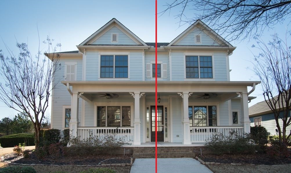
Above you’ll find an example of a symmetrically balanced home. Elements used on one side are the same or similar to those on the other side. In this case, the two sides of the home are nearly mirror images.
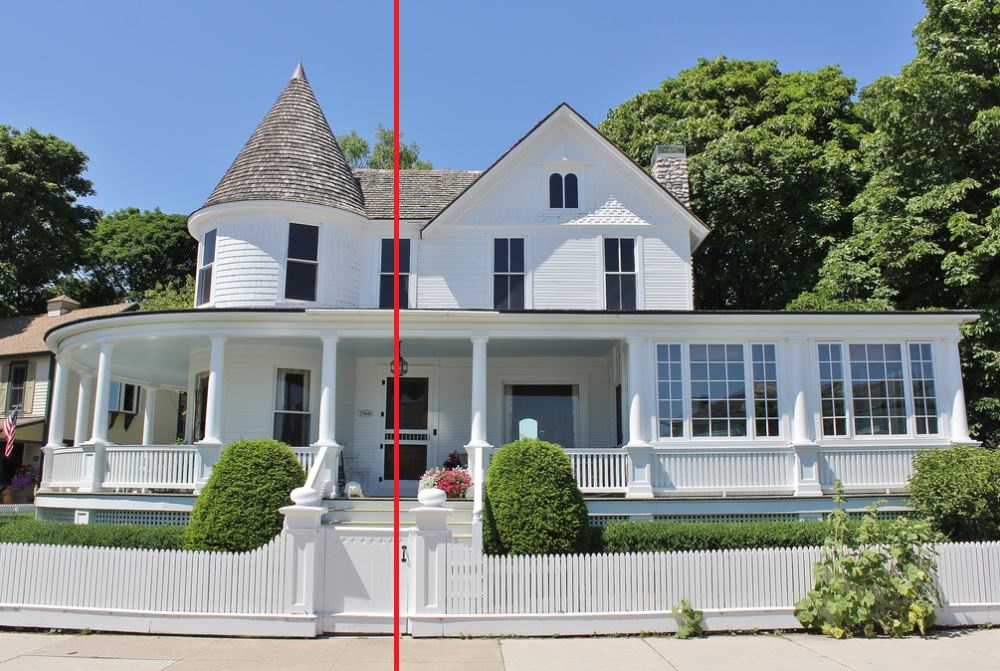
The house pictured above is an example of an asymmetrically balanced home. The sides are different but have equal visual weight. On the upper left side of this home there is a turret balanced by a gable on the right. On the lower left, there is a porch whose shape follows the curve of the turret and is balanced by an enclosed rectangular sunroom on the right. Although the shapes are different, the two sides balance each other out because they have equal visual weight and proportion.
Proportion
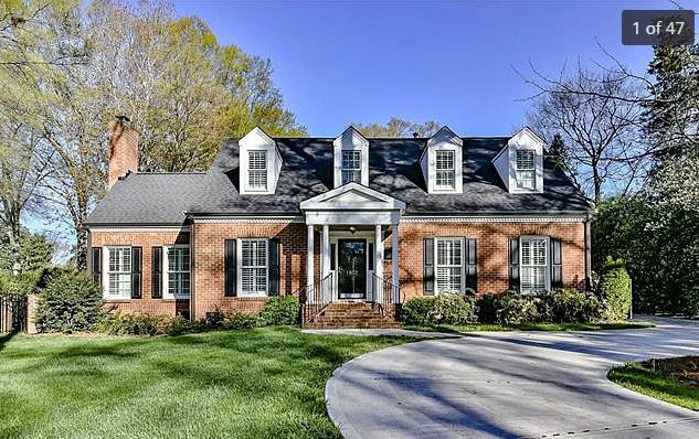
The relative size and scale of the various elements of a design. It is important that the elements of a design be appropriately sized/scaled in relation to one another to create a feeling of unity. It’s common to see incorrect proportions in sizing and scale of front entry porticoes. Take this home for example:

The columns on the portico pictured above are too tall and skinny. As a rule of thumb, the height of a single-story column should be about 10 times the diameter of the column. The scale of these columns would be more appropriate for a space half of this height. In addition, the pitch of the pediment is too steep and the covered portion is so small and so high up that its purpose of protecting the front entry from the elements is virtually defeated.
The portico pictured above is much more proportional to the home. The pediment has an appropriate pitch and the columns have a better height-to-width ratio.
Emphasis
The part of the design that catches the viewer’s attention. Often the designer will make one area stand out by contrasting with other areas. The contrasting area could be different in size, color, texture, shape, etc.
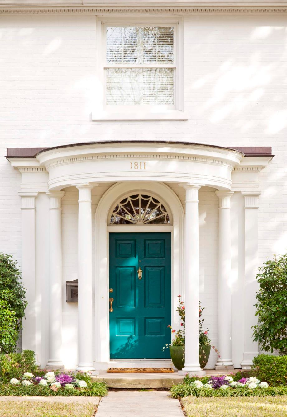
In the front entry pictured above, a bold peacock green paint has been used to emphasize the front door, in contrast with the mostly white façade.
Rhythm
When one or more elements of design are used to create a feeling of organized movement.
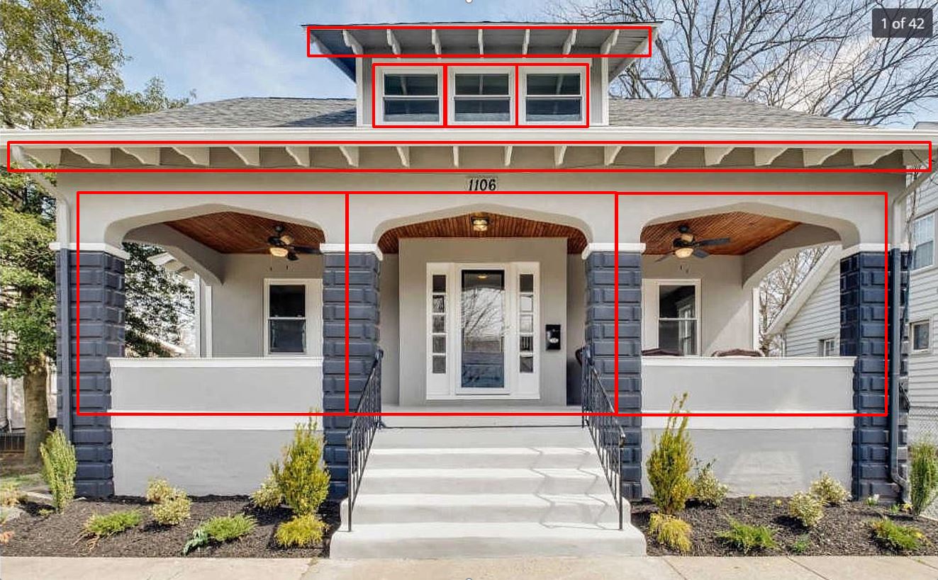
The exposed rafter tails, arched openings, and consistent use of thirds all help establish a rhythm to the façade of this adorable craftsman bungalow.
Repetition
The use of the same or similar design elements multiple times to create unity.
Movement
The path the viewer’s eye takes through the space, often to focal areas.
Variety
The use of several design elements to hold the viewer’s attention and to guide the viewer’s eye through the space.
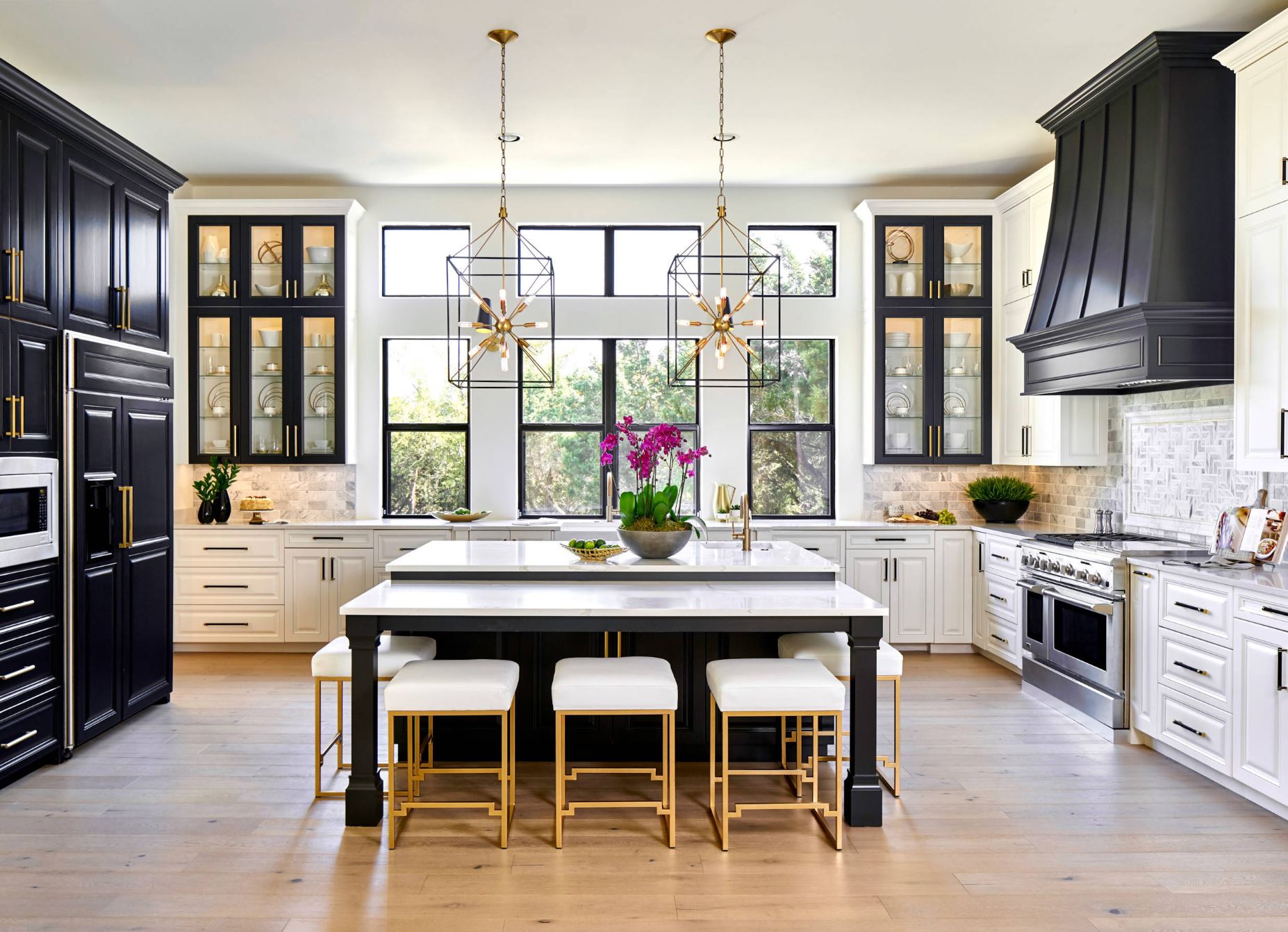
It is just as important to apply the nine Principles of Design to the interior as it is the exterior of a home. In this kitchen, the designer has used repetition of contrasting black elements, strategically placed throughout the space, to create movement. These elements guide the viewer’s eye through the space, ultimately drawing the eye toward the focal point – the windows and the view beyond. Brass accents and a natural stone backsplash add variety.
Pattern
The repeating of an object or symbol.
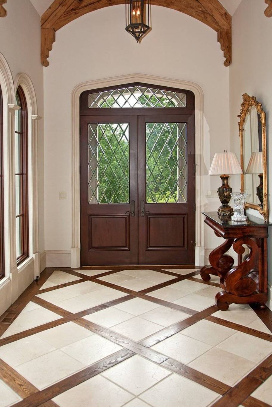
In the foyer above, a combination of wood planks and tile have been used to create a pattern on the floor. A similar pattern is repeated in the leaded glass on the front door and transom, creating a feeling of unity. Pattern can be used to guide guests through the home and delineate areas such as, in this case, the foyer.
Unity
The feeling of harmony between all parts of the space, creating a sense of completeness. By now you’ve seen this word pop up several times. Unity is the culmination of the successful use of design principles.
These Principles of Design can be applied to any home, regardless of square footage, market value, or architectural style. Although the examples I’ve used in this article are all conventional styles of American architecture, look at some of most radically innovative homes around the world and you will see skillful implementation of these principles. Now that you’re aware of them, see if you can spot them out in the wild!
Cheers!
Stephanie
BOWA Designer
Photos taken from screenshots from Zillow.com, Houzz.com and Flickr unless noted otherwise. The use of this content is for the purposes of education consistent with 17 USC §107.
OTHER POSTS
